The first thing I did when I bought my copy was gape at the inside cover art and try to wrap my head around the complexity of the glyphs and faces and maps. Actually, just the maps at first because I was in way over my head with the glyphs. Just seeing these endpages convinced me that all the hype was totally justified. (Then the story blew me away, but that's a different topic).
Anyway, thanks to the great analysis of the herald pictures in another thread (
http://www.timewastersguide.com/forum/index.php?topic=7910.0) I feel like I have a handle on the glyph/herald bit, and I'm revisiting the pattern I saw that first day. I'm going to just describe it in text and let someone with better image skills than mine take care of posting illustrations/scans.
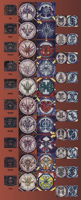
Others of you have probably noticed that the glyphs on the brown Roshar page and the blue Shadesmar page are the same, just permutations of each other. Not just stylized versions, though--they follow the symmetry rules of Roshar in interesting ways:
The gem glyphs (the smaller circles) in Shadesmar are the Roshar glyph with the right half inverted vertically. The herald glyphs (the larger circles) are a different kind of inversion--the blank space and character space change places. That is, the Shadesmar herald glyphs are like a negative image of the Roshar glyphs. Invert the colors of one and you get the other, with allowances for style and script.
It took me a while to figure this out, partly because of the similarity of some of the herald glyphs to their inverted counterpart, but mostly because I had the schematic oriented wrong. In both cases the map page defines "down" for the double eye of glyphs.